

FLEXBOX :
Flexbox use for styling in css elements makes for repositioning and resizing a container and its properties in one dimensionally. Means it is work one dimensionally at a time. Flexbox is sometimes called a flexible box layout module.
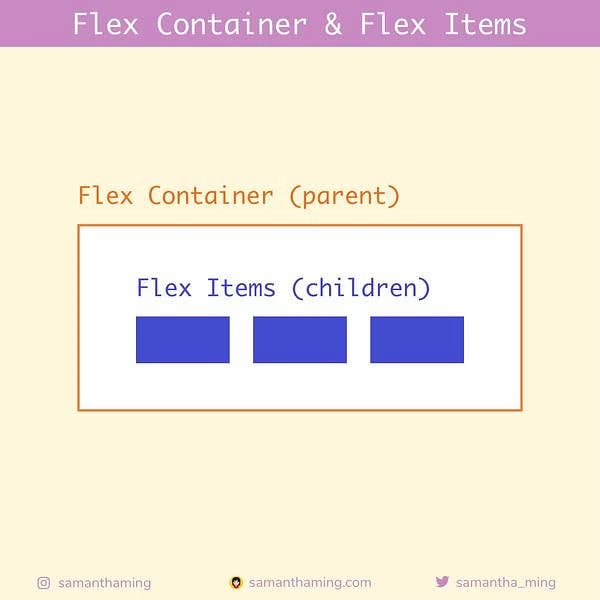
In order to get Flexbox to work, you need to set up the Parent-Child relationship. The parent is the flex container, and everything inside the container is direct child to this container.
(1)Properties for the Parent(flex container):
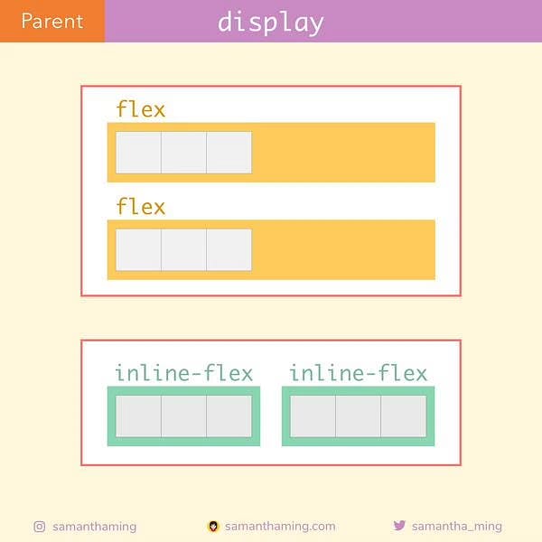
(1.0) Display:
At first we need to given the value of the flex. Which type of flex box we need 1.Flex(by default block) or 2.Inline.
syntax

display: flex
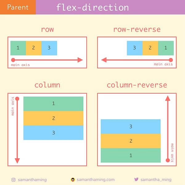
(1.1)Flex Direction :
Direction give the axis of the container properties means which places it will be place . We have 2 axis in the web pages Vertical (column) and Horizontal (row).
.parent {
  flex-direction: row /* default */
               or row-reverse
               or column
               or column-reverse
}
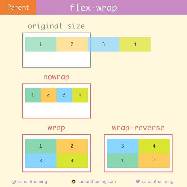
(1.2)Flex Wrap:
this work on when page space getting short by you the Bigger content will adjust the small pages .
.parent {
  flex-wrap: nowrap /* default */
          or wrap
          or wrap-reverse
}
(1.3)Flex-Flow:
So we've learned flex-direction and flex-wrap. If you understand those 2, you'll get flex-flow! Because it's just a shorthand for these two properties
.container {
  flex-flow: column wrap;
}
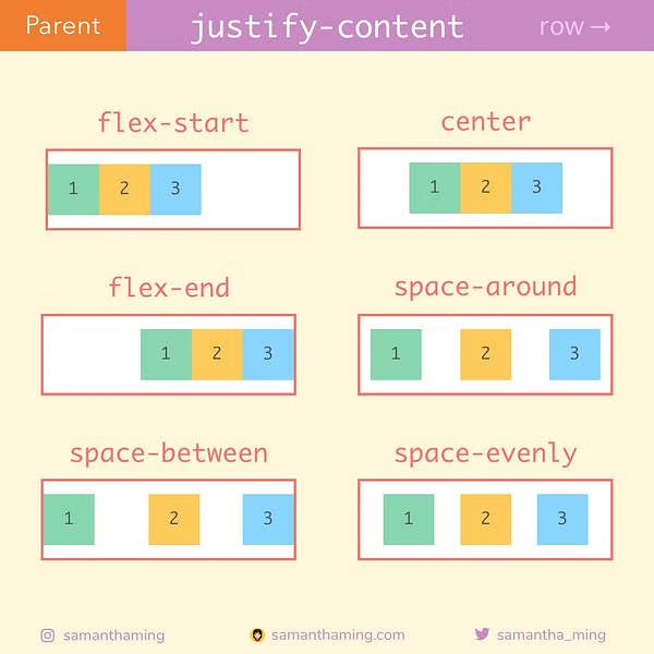
(1.4)Align-item:
This is Fun part on inside the container. In one word justify content adjust the spaces in proper way in the container. It work on Horizontal line.
.parent {
justify-content: flex-start /* default */
or flex-end
or center
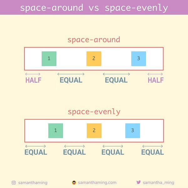
or space-around
or space-between
or space-evenly
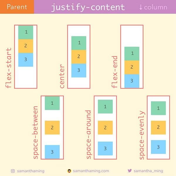
(1.5)justify content:
This item sitting vertically when content sitting in the web page.
Justify means Vertically adjustable.
(1.5)Gap, row-gap, column-gap:
For using gap select the distance between each elements.
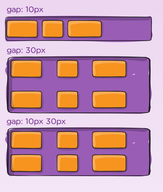 Flex child
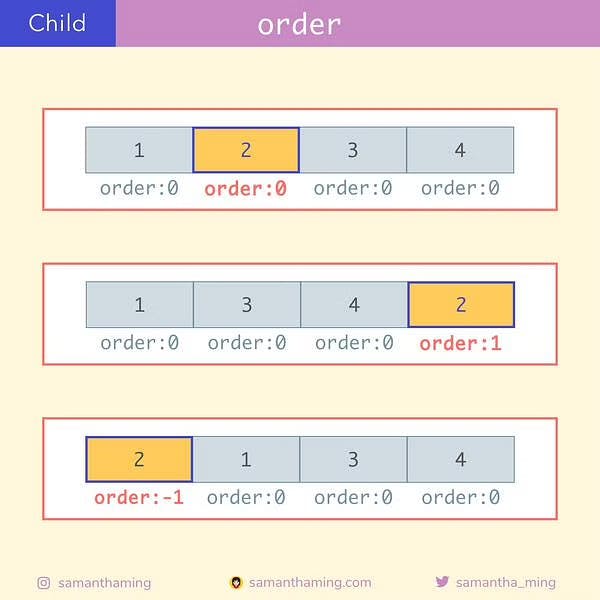
(1.6) order:
The order property control the order which appear the flex container.
.child {
  order: 0 /* default */
      or <number>
}
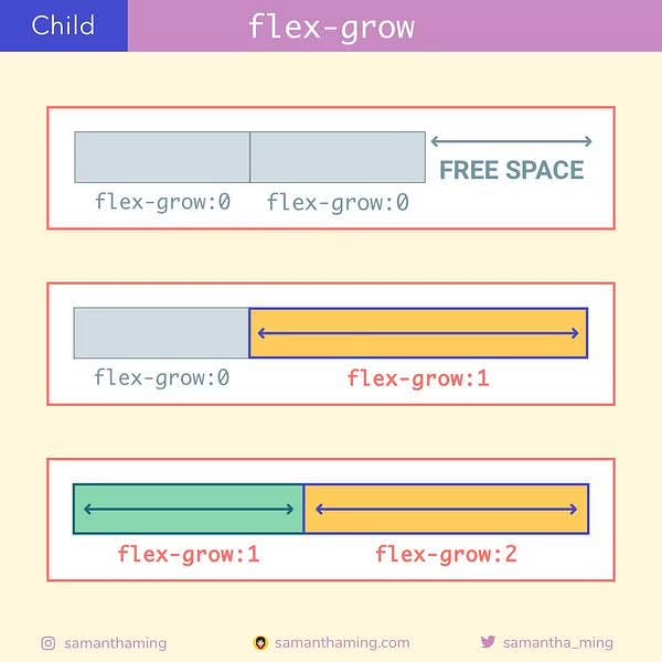
(1.7) Flex grow:
This content can adjust the box sizes in the container.
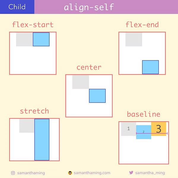
(1.8)Align-self:
Align can move only one box inside the container.
child-1 {
  align-self: stretch /* default */
           or flex-start
           or flex-end
           or center
           or baseline
}